Once a week FWN features a show poster from the Fort.
---
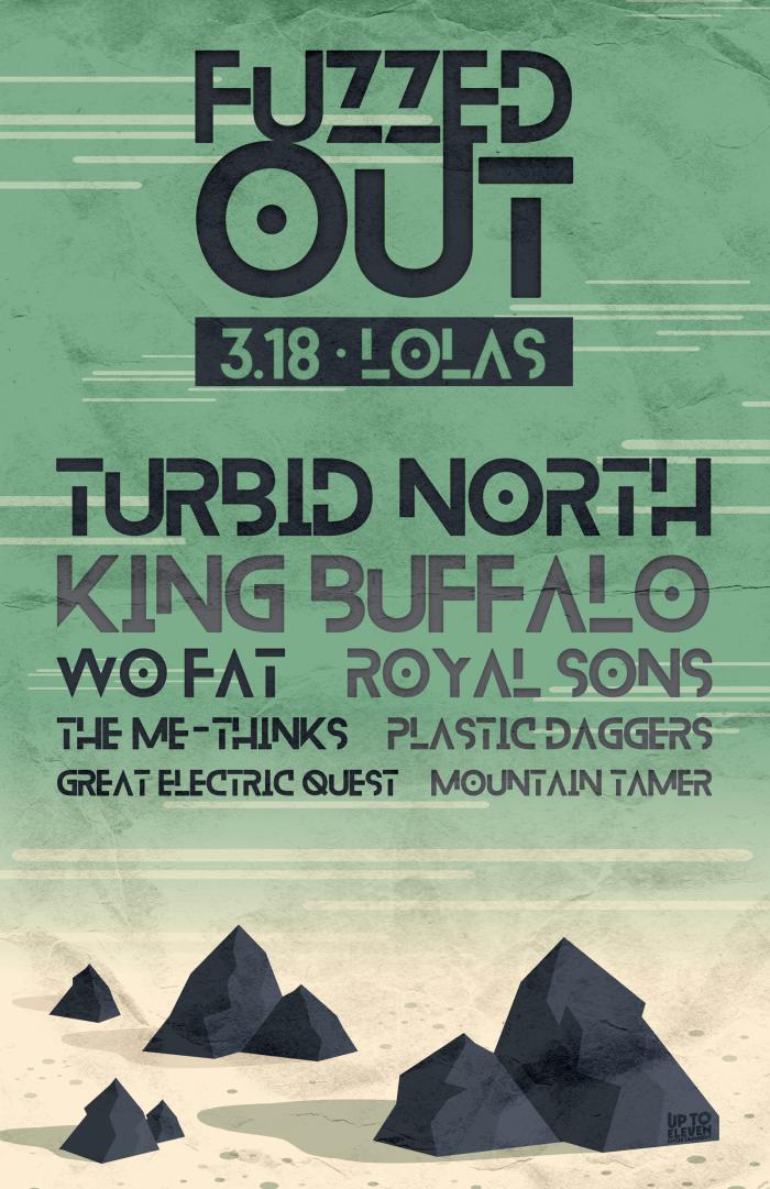
This week's featured show poster promotes Up to 11 Entertainment's annual Fuzzed Out! Fest going down this Saturday at Lola's.
Fuzzed Out's fuzztastic lineup includes a grip of national acts coming off SXSW shows and is headlined by D/FW's adopted sons Turbid North (for your visual + aural reference, see below music vid).
Rolling into town fresh off three SXSW gigs, Stickman Records' King Buffalo (NY) co-headlines.
Plastic Daggers (CO), Great Electric Quest (CA) and Mountain Tamer (CA) round out the national acts with Wo Fat, The Me-Thinks and Royal Sons providing local support.
Doors open at 6pm, music starts at 6:30pm. Full event details posted here, tix can be purchased here.
From the new album "Eyes Alive" out 11/20/15. Directed and Edited by Nick Forkel - Additional Camera work by Brian Bridger - Pre-Order at http://www.indiemerch.com/turbidnorth
Didn't have to look too far to discover that Up to 11's Duane Smith (former bassist for Southern Train Gypsy) designed this mountainous wonderland of a poster.
Fuzzed Out! Fest is Smith's brainchild, and bonus: he performs all the booking and promotion duties as well. I also recently caught him slaying the bass at The Grotto for STG's farewell show ... seriously, I'm tellin' y'all this dude is a veritable one-man force!
Moving onto the poster design you may recognize a familiar friend, one Mr. Seafoam Green. For more of our thoughts on him check out last week's show poster which also featured our favorite shade of green.
The image itself is what really got our wheels turnin'.
Given the name of the event one can't help but draw out the parallel between it and the depiction of a desolate mountainous desert region begging for an oasis to appear. I mean nothing's fuzzier than the visions of a water-deprived wanderer walking the desert, right??
The horizontal beige and white lines in the sky lead one to think there's no end in sight with nothing but blurred out horizons ahead. Makes me wanna ditch everything and commence a vision quest right now!
One of the themes we discuss here almost every week when evaluating these show posters is how well the poster's aesthetic matches up with the event's overall aesthetic? Well, here we are again and yet another designer has captured this aspect perfectly, marrying the two together in harmonious synchronicity.
I also mucho dig on the font choice, especially the alternating black and gray colors. Smith did a nice job working in the Up to 11 logo as well; did you notice it at first? Or even at all?
Lookie here, if I weren't Spring-breaking with my little monsters all week I'd be tearing up the mosh pit at Lola's this Saturday. Nonetheless, since I can't be your personal vision quest guide, here's a map so you won't get lost in the mountains on your way to the show.
Major s/o to Smith for designing this poster and in general, for being a badass jack-of-all-trades.
---
about the word writer person:
Prewitt Scott-Jackson writes Dad poetry & short fiction when he's not hyping and typing for Fort Worth Noise. His writing can be found in Ghost City Press (New York), Five 2 One Magazine (Los Angeles), Prairie Schooner (University of Nebraska Press) and Sick Lit Magazine (Texas), among others. He prefers short walks on the beach because – and I quote – “It’s really hard to walk on sand.”


